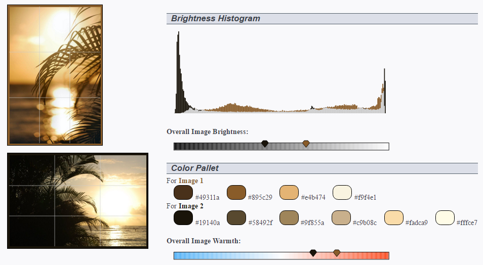
Whether you want to see how well two images go together, or see how your photos differ from the professionals', the Photo Analyzer and Comparator is here to help. Scrapbooking? Web design? Use the automatically generated color palette to get a set of complementary colors to improve your overall design. Trying to mimic another photographer's style or a specific image? The grid lines can show you whether you need a closer crop. The warmth and brightness scales can show you whether you need to adjust your camera settings to let in more light, or increase the color debt. By doing a side by side comparison the differences becomes more noticeable, giving you a chance to learn from the comparison piece, and how others artists achieve their masterpieces.
To get started, upload your photo or select one from the Web. Image details, including the histogram, overall brightness & warmth, as well as meta data still preserved in the image will be displayed on the right. Select another image to see how the two photos compare.
Interest in Scrapbooking or Design? Try our Image Color Palette, which uses machine learning and color theory to identify additional aesthetically pleasing colors that can complement your photo.